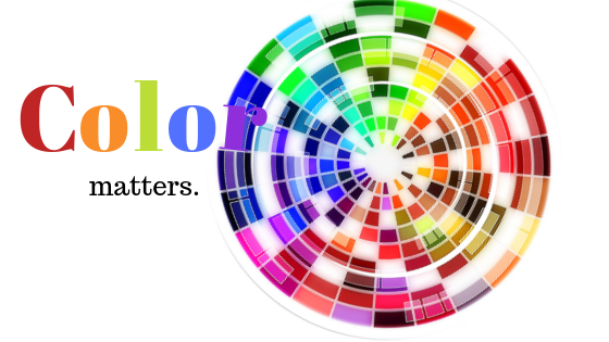
Consumers make subconscious decisions about products and brands based on color, so be sure you are making conscious color decisions on behalf of your business.
Did you give your brand a personality when you gave it a color? In the same way that a parent names a child, companies name their brand. But…perhaps the color of that brand influences personality the same way a spelling changes a child’s identity. Charlie is not the same as Charli, and definitely not the same as Charleigh; just as the Nickelodeon logo wouldn’t be as fun and cheerful if it were steel gray. And what if McDonald’s golden arches weren’t golden? Would we still crave their french fries if they sported blue arches?
Although personal experiences influence our emotions and connections to color, our culture and environment certainly affect how we perceive color as a society. Recent studies indicate that people make subconscious, impulsive decisions based on color alone within 90 seconds of viewing a brand or product.
Think back to your childhood. Long before you could read the words of a logo, you could spot Mc Donald’s golden arches from six blocks away. One would be willing to bet that it wasn’t so much the giant “M” that made them identifiable, but that they were golden. If we were to flip that “M” upside down into a “W”, preschoolers would still be begging for happy little meals as they passed by. If the “Nickelodeon” in the famous orange paint splatter were suddenly replaced with the word “education”, kids across the country would still tune in expecting to find Ruby and her little brother Max.
Color is important. Not just for your brand, but for your promotional products, commercial vehicles, business cards, and even invoices. It should come as no surprise that a whopping 80% of consumers think color enhances brand recognition. A black and white image usually sustains interest for less than a second while the same image in color can hold a viewer’s attention for up to 2 seconds. Adding color to something with text (advertisements, invoices, newsletters, etc.) not only improves readership but improves learning by more than 20% and comprehension by more than 70%!
There are the obvious color associations (especially with food); all orange sodas have orange labels; bags of ice tend to be blue and white; while all things hot and spicy wear red packaging, but here are a few you might not have thought about:
Yellow is considered a warm and optimistic color while orange is perceived as fun and cheerful but has also landed on the least favorite color list because it’s thought to look “cheap”. Yikes! Red wins the award for fast, bold and exciting, while green is obviously synonymous with peace, health, and nurturing. It comes as no surprise that blue represents trust, dependability, and strength, while purple is viewed as wise, royal, and courageous. Black is often times thought of as expensive and high quality, while white feels pure and clean. And as the perfect combination of black and white, the color gray reminds people of balance and neutrality. In a nation full of coffee lovers, the color mocha makes us feel warm and cozy, while brown is the least liked color across the board by both men and women. Sorry chocolate! And where’s pink? I guess there aren’t enough bubblegum and strawberry ice cream lovers for it to have made the chart!
Use color as a tool to help your business grow and stay relevant. Even if your company logo is well beyond the point of rebranding or recoloring, consider using color in other ways. Add a bit of blue on your invoices to appear trustworthy while your customers write that check or a bit of green on your packaging to appear environmentally friendly while subtly reminding your customers to recycle. Consider giving your clients silver or gray umbrellas to make them feel a sense of balance and discretion as they muster through the rain and keep your attention-grabbing red logo on the handle.
So whether brand colors have influenced consumers or consumers have influenced brand colors, color matters.


